Unless otherwise noted - Photos, Text by Mike Strong. All code is original by Mike Strong. Copyright © Mike Strong All rights reserved
| MikeStrongPhoto.Com | KCDance.Com | Artfuldancer.Com
| blog
|
Shooting: Stage vs Camera placements
See the companion article about lighting versus darking
Camera versus Eye and Perception
Cameras accurately record physical details and relationships
at the same time
Cameras do NOT record human perceptions accurately
although composing in the frame can generate a simulation of those perceptions.
What we perceive in person differs from what is recorded by our devices, our cameras and our audio recorders. In some cases the recording device emphasizes something we didn't notice in person and sometimes what we noticed in person is barely recorded at all on our devices. Our senses select, edit and display the universe around us in real time in ways our devices can't begin to. For example, when working in a studio with fans running we tune out the sound of the fans but when we shoot video in the same location and then listen to the recorded sound those fans seem more like a B-17 warming up next to us (even a single fan will sound like this).
In another situation I shot a burlesque dancer who silenced an audience so they could hear as she squeezed her pasties which squeaked. We heard it clearly in person but on the recorded audio the sound was almost not there. I could see the action on video but couldn't hear the sound. To make the recorded sound match our perceptions at the time I had to massively boost the volume of that section of the audio in a sound editor. Luckily the audience had gone quiet to hear those squeaks which meant there was no other extraneous sound to also amplify otherwise the squeaks would have been buried in the volume.
Color Constancy (human) versus Color Balance (cameras)
1 - Adjusting color to match expectations for a normal spectrum (sun)
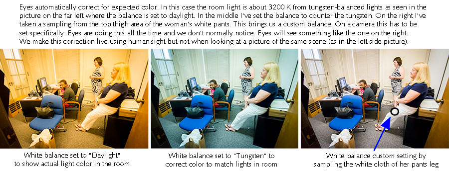
The default/natural and best color setting for a camera is for a daylight balance (5,500 K). Our eyes are tuned to see in daylight as are our cameras. Both eyes and cameras can adapt to different colors. In the picture we are showing three color balances. The one on the left shows the actual color spectrum from the interior lighting in this office which is from tungsten-like (warm) spectrum flourescents with a color temperature of around 3,200 K.. The two photos on the right have been adjusted to fit our brain's expectations.
Our eyes will normally make their own adjustment for any scene, such as this. The picture at the far right was specifically adjusted in Adobe's Lightroom to use the white cloth on the woman's pants as the adjustment target on the top of her thigh where the office lights fall most directly. Our own eyes will make that white look white regardless of the illumination, sun, tungsten, warm fluorescent, regular fluorescent (greenish), and so forth.
2 - Perceiving full color using a difference in gray scales plus a single-color overlay
OR, the very un-simple ways in which our eyes perceive colors (clue, not just based on red, green and blue cones)
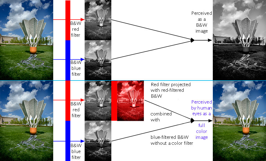
Dr. Edwin Land, the inventor of the Polaroid camera performed an experiment with two black and white pictures taken with different filters. He took one B&W picture with a red filter and the other B&W picture with a blue filter. When projected on a screen together they showed a normal B&W image. However, when the B&W picture taken with the red filter was projected with a red filter and with the other slide without a filter something unexpected happened.
You might expect a grayscale image with an overall red tone but instead of that, to humans, the image is perceived in full color, duplicating the original scene. No one yet has a good theory why full color is produced in human perception by placing a red filter over the B&W slide made with a red filter combined with the B&W slide produced with a blue filter.
This indicates that the mechanism which accounts for color perception is far more complex than simply combining the result from red, green and blue cones alone. And no one really knows fully what it is.
3 - Edge perception in rods and cones
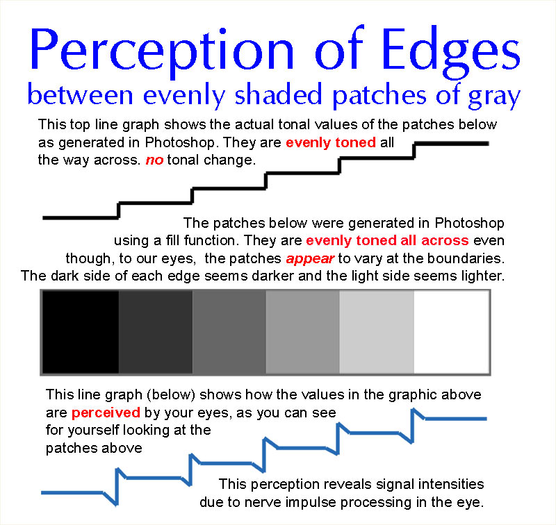
Remember that old song about "your lyin' eyes?" The song is ironic. In real life our eyes are not exact recorders of the visual field as in the previous example and this example. What you see below is a type of optical illusion, one you've seen numerous times and probably not noticed. The grayscale tones in the patches below DO NOT vary near the boundaries, but your eyes make it seem that the tones of each patch changes at the locations on the patch where they border an adjacent patch. I assure you that I drew each patch in Photoshop, selected each area, then filled each area with a different gray scale value. Again, the tones are flat with no variations, we perceive variations at the boundaries.
Edges need a difference in brightness to be distinct. Edges between colors, with no brightness differences, seem unfocused or fuzzy. The brightness gives clear edges. Blue is not used by our eyes to see differences in brightness. We don't have enough blue cones. Fields with differences in blue light look generally unfocused and indistinct. Also note that colors change as the overall light levels change.Spacing
Perceptive Differences: Spacing for stage vs spacing for camera
Why they can overlap but don't always mix
This is a bit of a detour from lighting but as long as we are talking about perceptions between eyes and cameras we should spend just a small amount of time explaining how stage spacing undermines and flat out sabatoges the camera. As a photographer, when performers go to or come from opposite sides of the stage I can only grit my teeth and realize that I am powerless to have a picture which even begins to have the same impact as the in-person experience. As a picture it just seems weak and distant with little insignificant figures spotted across the frame. Even though the physical angles and measurements are accurate in the picture the perception of the picture from a seat in the middle of the house as totally different than the perception a person has sitting in that same seat in the theater.
Spacing and placements for camera and spacing and placements for stage there is a certain area of overlap but there is also a certain amount of outright opposition to each other.
In both cases, stage and camera, we are trying to do the same thing, arrange performers so that the relationships between characters is presented to the audience as intended according to their arrangement (spacing) within the medium and according to the story.
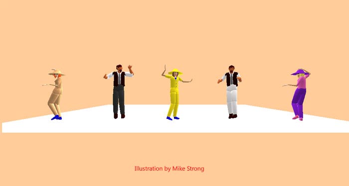
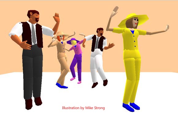
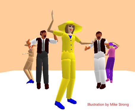
1 - Stage placement is primarily on the "X" axis - left and right across the stage
2 - Camera placement is primarily on the "Z" axis - front to back and tight within the frame
3 - There are always exceptions and there are generally areas of overlap
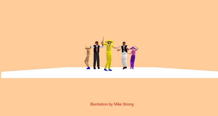
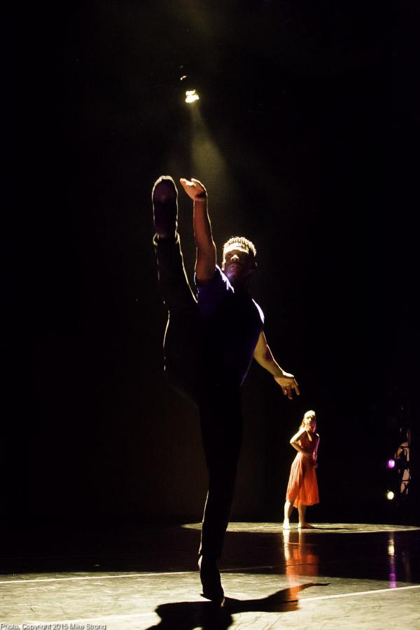
On stage almost all relationships and actions are handled on the "X" axis, left to right across the stage. On stage, in person, all these characters take on importance for audience members based on the woy our brains process information and select for attention. As an image the figures look tiny, distant and weak because our brains don't "reach into" the image the same way, instead our brains seem to take the image presentation as is. Even so, the performance is directed straight out into the audience and into the camera because this view is from the sight line. Close views from this camera position are helpful in grant proposals to give a sense of the performance and a sense of the purpose of the piece.
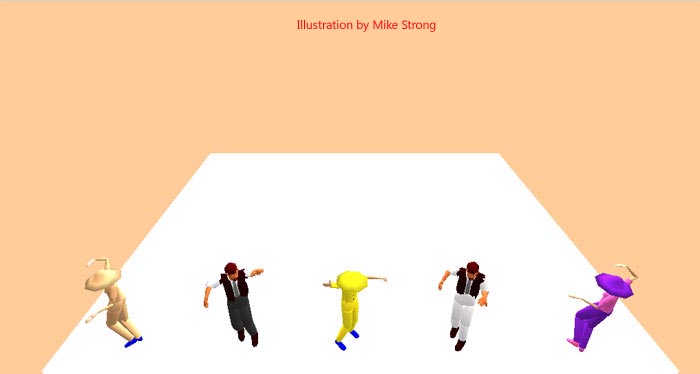
Another version of the image above, this time generated with the camera position from high, as if placed in a balcony or cat walk. This camera view is handy for recording stage placement and movement but clearly seems distant and loses all power that you would have from a camera on the sightline. Normally; stage action is directed straight forward, at sightline height. By moving higher than the thrust of the action you loose any further sense of directed performance power from the performers. So, as a document or as a sales device this tends to wimp out. This view serves best for reconstruction purposes.
Dancing with the Stars tried to do a take off of Astair and Rogers but didn't quite get it. The tap was too heavy for one thing but kudos to the pair for a nice try. The other, larger problem was in the camera's movement, dollying back as the dancer came forward into the camera and rising above the dancers, looking down from the crane. All the energy in that piece was forward at eye level. By moving the camera (1) they lost a chance for the dancers to work into the scene and (2) by moving upward and looking down the camera lost the remaining energy in the piece which was now directed under the camera.
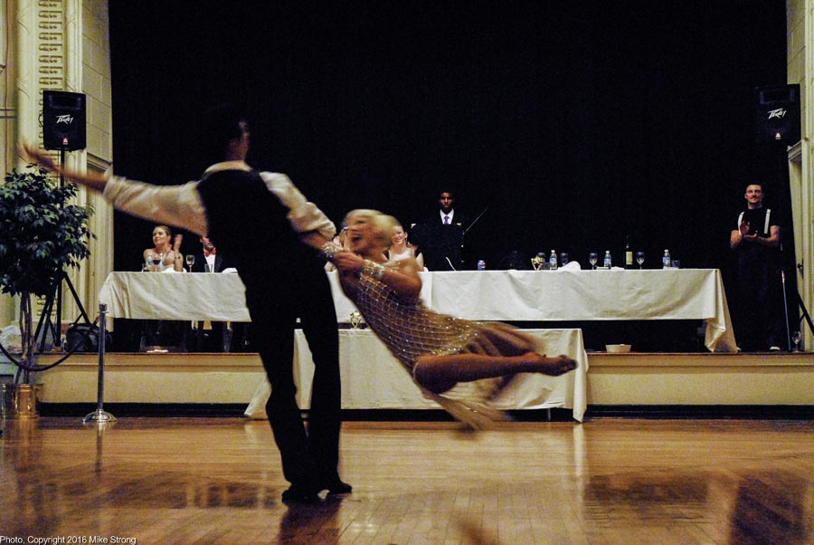
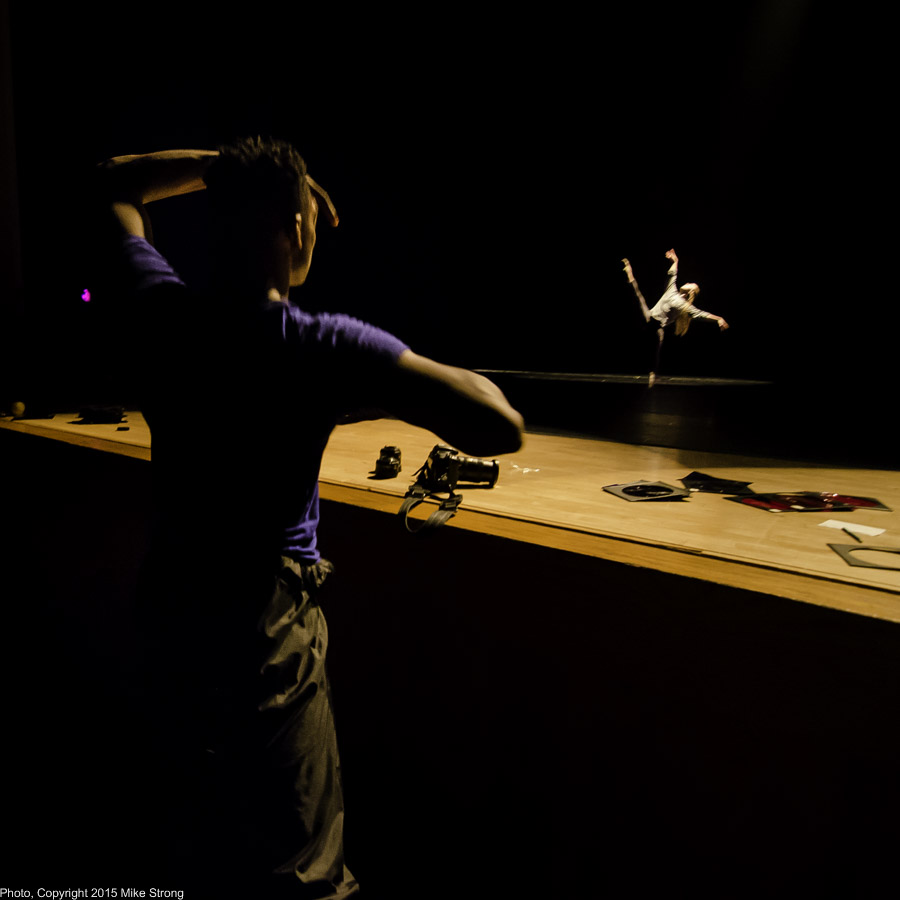
Natalie and André Paramonov, May 13, 2006, 10:44 pm exhibition dance. Louis Bar is standing at far right.I learned this lesson some years ago when shooting a pair of top ballroom dancers, André and Natalie Paramonov, brought in for a workshop by Louis Bar in May 2006 at Drexel Hall. The ballroom was crowded as people pulled back around the floor to let the Paramanovs give an exhibition dance. I was in front to get a clear field and I was attempting to be nice and drop the camera lower so that I could be out of the way of the people behind me.
When I got the video back to Louis the first thing out of his mouth was, "What happened? Where is their power, their energy? They are such a powerful couple but I can't see it." Louis immediately realized that my camera was too low. He said that all their energy was lost over the top of me. I thought I had a good angle (down low and typical for photographers - works often). Most people looking at the video still think it looks good.
But when Louis said that about the loss of their power I recognized that I should have remained at chest height or a little higher with the camera as they performed into my position, at eye level. Instead the camera was maybe 2.5 to 3 feet high. I only needed another foot or foot and a half. The video was all that was left and it had been weakened by the shooting position.
The people watching would have done just fine looking around me and they would have remembered the dancers, not the camera. The camera, on the other hand, needs to be placed just right because we see the image as it is recorded, not as our brains re-construct it when live. We couldn't go back and re-do the shoot. It was a one-time performance.
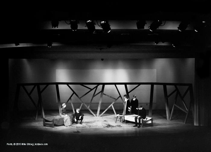
Spring 1973 production of "The Crucible" at Platte County Community College, Nebraska - full-width stage shot from back-of-the-house balcony. I shot this image with my 4x5 Crown Graphic. It certainly shows places onstage but photographically the picture is weak, distant and dull. Photographers tend to cringe and sigh when presented with this shooting situation because they know there is nothing they can really do to make their work look photographic.
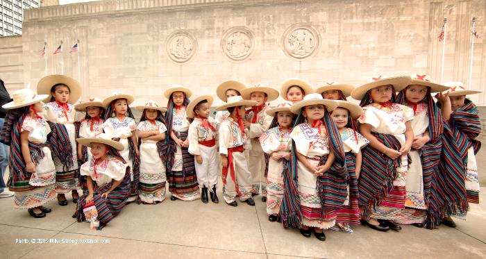
Which is not to say there aren't plenty of times a fully "X" axis (left-to-right) photo can't work, as in my shot of very young dancers with Grupo Folklorico Atotonilco in Barney Allis Plaza, downtown Kansas City, Missouri, for Fiesta Hispana, 2008. Remember, rules are best thought of as Hints from Heloise about repeating what works best and avoiding what generally fails. Work those rules but keep an open eye.
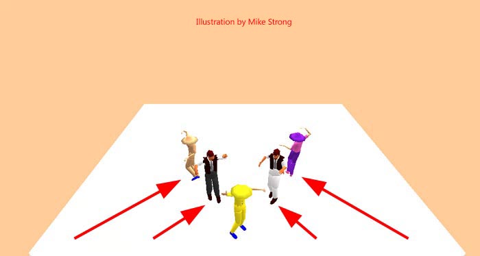
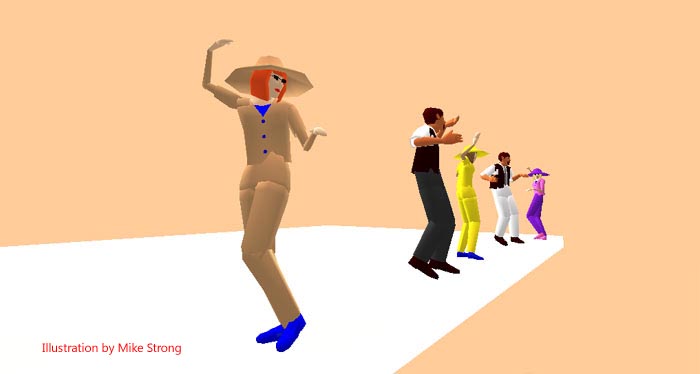
A simple way to modify stage placement for camera is to fold the line across from the middle backward (or forward)
Here we've folded the pattern forward. Again, good for camera (here and below), not so good on stage, as shown above.
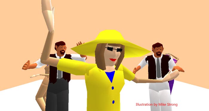
Here we've folded the left-right stage arrangement backward using the person in the middle as the hinge. In a photo it replicates the feeling of watching a live stage from the audience position. But as you can see below, the same arrangement looks weak, distant and hard to see what is going on when live on stage.
Here is the camera arrangement above shown as it looks to a live stage. (full stage width) Clearly this leaves a largely empty stage with a bunched up group of people in the middle. This is a camera arrangement and doesn't really work well when live.A couple of example shots from a "West Side Story" production at UMKC.
Above: This was shot specifically as an example to go with the picture at left.
Here is a full-state-width shot during the same portion of the routine (35mm lens from the back of the house). This time flat from the front.
Live, as an audience member, the relationship between Tony and Maria is taken in and selected for importance by your brain.
However, in the picture above the only evident relationship is one of being in the same frame. They are widely separated and from this angle any relationship is either lost or greatly weakened. This entire picture is distant and not as intimate as the picture at the left. The natural dynamics of the front to back images shown at left is lost in this picture above which is just flat and pretty much disconnected.
At Left:
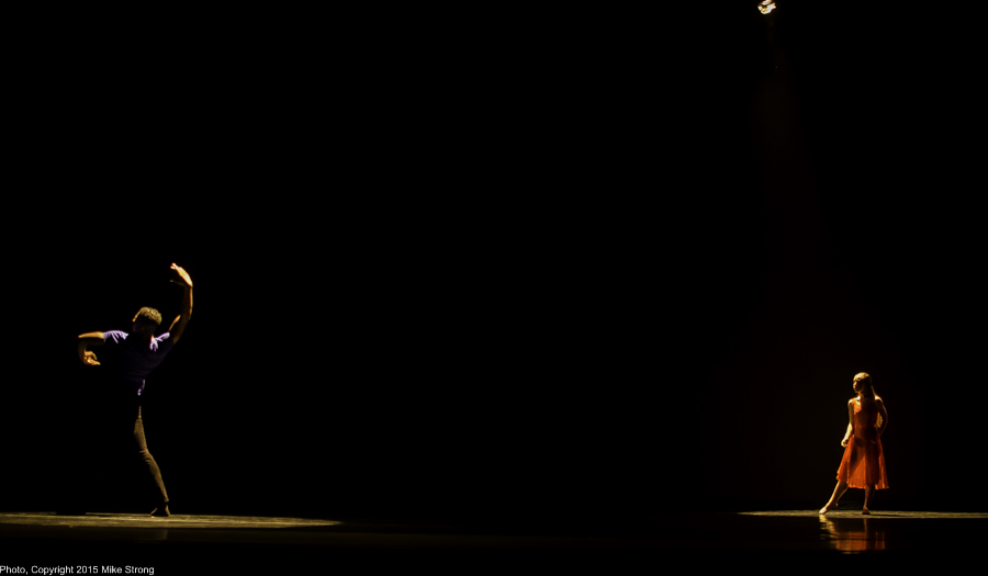
This shot from down-stage right and pointed across the stage establishes, for the photo, the relationship between the two dancers (our Tony and Maria characters). This also shows a little of the wings although what we see there could be cropped or painted out. Overall, a much stronger than the image above.
Below left is a front to back stage arrangement, also good for camera, which comes just before these two pictures.
Here is a front to back shot of a stage show rehearsal. In this case one of the dancers (John Swapshire as Tony) is standing in front of the stage apron watching the other dancer (Kelsie Crawford as Maria) who is upstage. Once he sees her, he heads for the stage stair and onto the stage to join her with at opposite ends of the stage. In this case the stage arrangement works equally well for camera.
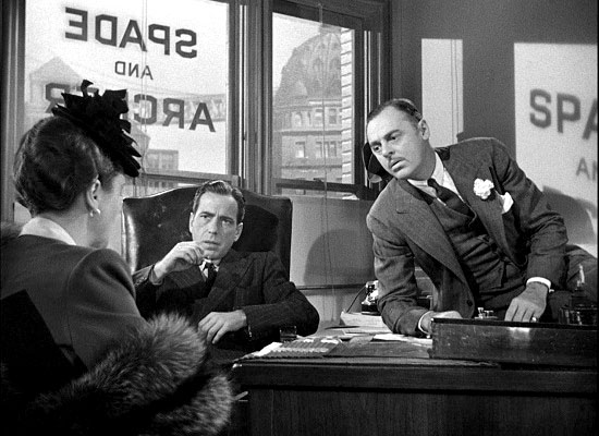
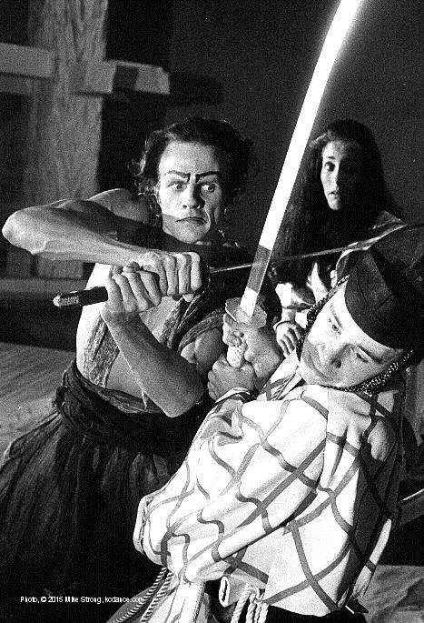
The primary relationship (left) is front to back with Mary Astor (as Ruth Wonderly) and Humphrey Bogart (as Sam Spade). The secondary relationship is with Jerome Cowan (as Miles Archer) from front to back again in a diagonal to the right. The setting is more front to back as we move to the window behind with their names, the wall behind with the light from the window spelling out the names and the buildings far behind.In this newspaper (Lawrence Journal World) shot of a "Rashomon" production at the University of Kansas in 1977, I walked around the stage and around the actors with an assistant holding a light on them until I could show the relationship between the characters.
From the audience this was flat across the stage. But for this picture I needed to replicate the feeling of involvement that a member of the audience might have with the characters and their narrative even though the audience member is not on stage and not physically circling the actors to find an angle.
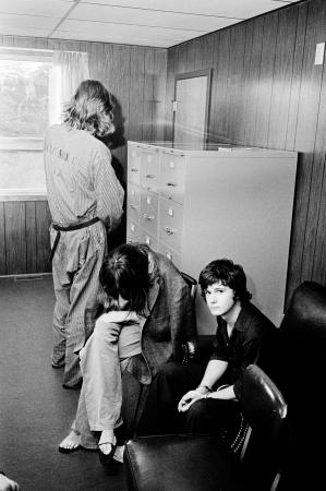
In this news shot (Geneva Times, now Finger Lakes Times) of three murder suspects you can see the relationships among them. I shot this in the Seneca County, NY sheriff's in 1976. This particular picture was never used in my newspaper for fair trial considerations at the time. Things have changed since then and this would probably be used.
The body of the man they killed, a retired cop from a Rochester suburb, was dumped in Seneca Lake (more that 700 feet deep) and was never recovered. He had invited them to go for a ride in his boat on the lake. These three were apprehended in Michigan at a motel and with the victim's truck. Here they've just been returned from Michigan after extradition. (fill flash)
In camera, almost all relationships and actions with any kind of depth are handled on the "Z" axis, front to back within the camera frame.
So many photographers go to the corner of the stage and shoot across in a diagonal direction. Not to get out of the way (unless they are taking performance shots and they mean publicity in your local newspaper). A picture from the side of the stage makes a stronger picture in terms of the size of the subject elements (people, in this case). You are pretty much assured that you will get someone up front and large in the frame. It could also indicate that the photographer (1) has no control over stage arrangements (unlike a photo studio) and (2) has given up trying to get a reasonable camera shot from some front center position.
It also shows the wings and whatever is going on there. In the shot I wanted the wings in the shot because Kelanie Murphy's pals are in the wings watching. So this is as much a performance shot as a buddy shot and a documentation of relationships among dancers. It is one of my favorites.
Even so, generally details in the wings tend to start teeth grinding away from the choreographer who has envisioned how this looks from the front and sees the extra business in the wings as taking away from showing the piece.
The photographer, in turn again, goes numb at the flatness and lack of strength in the same shot from dead in front, a truly "dead" shot and then usually argues that he or she is showing not the piece as such but the production and the story around the piece. And it goes on and on.
When you are showing a dialog between two people, a "two shot", a CU (close up) of just heads may be fine although it will miss how they stand next to each other. In dance it is almost always not a good idea. Anything at the top is affected by everything from the feet on up, so you want to show the whole dancer as a complete work.
Here we see only half the production and maybe not even that. Because the action at the top of the frame, arms, heads, shoulders, etcetera all depend on the actions at the bottom, starting with the floor then the feet and on up, we get only a fragment of the whole. Just enough to be frustrating and to look truncated.
WATCH GENE KELLEY MOVIES: In the dance scenes you will always see the full dancers and you will see a front to back depth in the dancing. In the non-dance scenes the camera often moves in closely to get the dialog visually. The camera doesn't just take picture of the choreography. The choreography includes the camera. Kelley's work remains as master examples.
Make sure you WATCH FRED ASTAIRE MOVIES. Astaire also remains one of the masters. His work is more subtle and really requires the camera to let the dancers/actors work. Some of it will look a little flatter front to back but only to the extent that it allows the performers to build a relationship with the viewers without having it pushed on them by camera maneuvers. This is no place to try to juice the performance with camera movements. The viewer will sink into the performance and into the characters as you let the talent do their work (it is what they are good at and what they were paid for). All the energy is directed straight forward, into the camera. .
For stage shooting WATCH AGNES DE MILLE movies of "Rodeo" and others. She was very particular and trained her cinematographers to her specifications. They are shooting on a closed set so distractions from the wings are not a problem. They also have a lot of front to back depth even though it is clearly on a stage. The camera moves in and among them allowing camera groupings. View her recorded works in the original 4:3 format they were shot in. If you want to see the footage butchered take a look at Rick Burn's documentary on ABT featuring Misty Copeland.
I know this footage because I've used it in an Antony Tudor documentary for the Tudor curriculum program. Burns cropped down the tops and bottoms of the frame to fit the modern TV widescreen 16:9 ratio. Often enough we lose the feet - of dancers. That, however, seems consistent with what he did on the footage he shot for Misty Copeland, starting with a frame from mid-thigh on up, so that we don't see her feet. We can see her turnout but it is not complete. Burns does this in slow motion so he thinks he is bringing something to the dance (which he states). He spent nine years with ABT getting this ready and was still not seeing dance. Someone there should have told him that he really needed dancers' notes. I did record it from PBS just for proof but I go into cringe mode when I think about it.
A little more front to back composition:
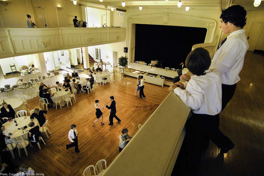
This is front to back and also multi-plane with three major planes: 1) near balcony 2) main floor and 3) far balcony with entrance and table areas below.
BTW: That is Jennifer Tierney and Kristopher Estes-Brown dancing in the middle of the floor. This was at a worship/showcase with Louis Bar, May 13, 2006.
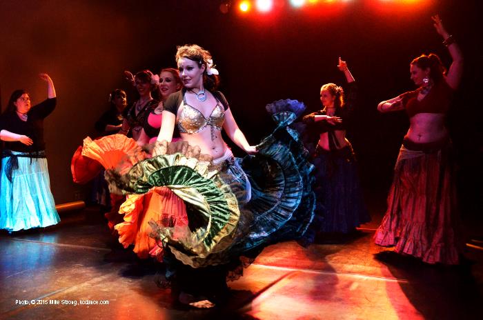
Local Troupe Duende belly dancers appearing at a national-tour performance by Belly Dance Superstars. Available light. Digital.
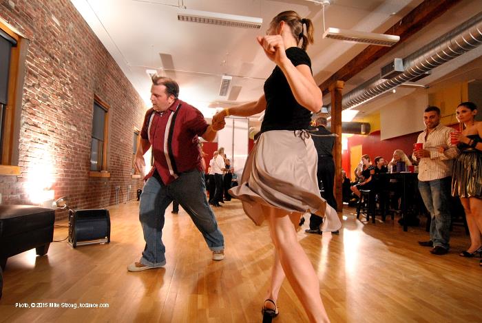
Again, I've set studio strobes around the floor. Alan and Anne dancing swing at Howard Carney's River Market apartment/studio. Digital.
Yes, I set the studio strobes to go off when my camera's electronic flash went off. This was shot on film at ISO-400 with a 20mm lens at f/8 so I really needed the light. ou can also see the great color and definition. This is a swing dance competition in the Grande Emporium on January 17, 1999 as part of a publicity package for the movie "Blast from the Past." It was normally so dark in the Emporium that until I showed pictures in color a lot of regulars didn't realize that the colored tiles were red.Recap:
In watching a stage performance from an audience position your eyes scan across the stage and your brain wraps that stage scene around your head in a way which places you, in your imagination, within the scene on stage. You see the stage in a fundamental way based on your physical prescence in the immediate space of the theater.
In looking at a picture of a stage performance, even one taken from the exact same seat in the audience, showing the full stage, your eye and brain simply see a picture. There is no mental reaching into the scene. Instead the brain seems to accept the photo as it is without rearranging things, as it does with a live scene. As such the action in the picture looks distant and the performers look small and puny.
Before I get to specific rules for lights which work for cameras I need to state again that there is overlap between stage placement and camera placement. Next, back to lights.
Setting lights based on the camera - a possible "two-fer"
When creating lighting which works for cameras start with the camera's optimal settings.
All those Hollywood pictures with noir lighting were designed with film which was, by today's standards, very insensitive to light. ASA's of 12, 25, 32 were common. 64 ASA was liberating and 80 or 100 ASA was starting to get into journalism and consumer films.
ASA stood for American Standards Association and was the precursor to today's ISO (International Standards Organization) sensitivity rating. These were ratings which were better in daylight with full sun, or under powerful lights in the studio. The same lights (or reflector panels) were used in the sunlight to fill in shadows created by the sun.
That means that those cameras needed a ton of light on the set to get a good exposure. And they could not expect to have the camera chase light settings. All cameras have an exposure setting which is optimal for that camera, lens and film combination and that is what the camera was set to. Instead the lighting was designed to work entirely within the single best exposure setting for that camera with that lens and that film.
Today's digital cameras start at 50-100 ISO and often go to 6,400 ISO or even 12,500 and 25,000 and more. I commonly work at 3,200 ISO, a sensitivity setting I couldn't dream of in the first days of DSLRs. Back then an ISO-800 setting was considered extremely high and carried a lot of digital noise. Then 1600 came in and ISOs kept moving upward. The higher ISOs were made possible with sensors and software techniques to fight digital noise which is always found at high ISOs. But boosting the sensitivity rating, whether film or digital sensor, creates quality compromises. There has never been any way around it. For the best image quality I would prefer to be able to use an ISO of 100 with at least f/8 and at least 1/500th second. Essentially that would be out in the sun.
Reflex Note:
A reflex is a camera where you look through a lens which projects the image to a focusing screen after being reflected by a mirror.
SLR means single-lens reflex and refers to a camera where you look directly through the camera's taking lens reflected from a mirror in the optical image path up to a focusing screen. When the shutter button is pressed the mirror moves out of the way, usually upward, afterwhich the shutter actuates. These days SLR usualy refers to a film camera (non-digital).
DSLR - is a single lens reflex with a digital sensor instead of film.
TLR means twin-lens reflex in which the camera has two lenses, the taking lens which sends the image to the film, and the viewing lens (usually on top) which is used entirely to reflect the image from a mirror upward to the focusing screen. Because the viewing lens is separate from the taking lens the mirror never has to move out of the way.In the days of film, ASAs of 80 to 400 were the most common settings (80, 100, 125, 200, 320, 400). Anything higher than that requires special exposure and development and/or special films for the most part. An ASA of 400 was the most common general purpose film speed and Kodak Tri-X was one of the most common ASA 400 films. There were some early ASA 1000 films such as Royal-X in 4x5 and there were ways to push development including special developers such as diafine. Kodak had a consumer color film rated at 800. You could get an equivalent of 3200 ASA. Some of the last new emulsions in Fuji and Kodak's TMZ had an ASA of 3200. In all cases, the lower the ASA the smoother the tonal scale and the finer the grain and the detail.
Using the camera as a reference point for light levels
The settings for camera will serve admirably as a setting for the stage, in most circumstances. Here is how to do it to get a "two-fer."
- Set the video camera on a tripod
- Point it at the full stage
- Connect it to a monitor or television
- Use the monitor or television to guide your light levels and colors
- First, set the camera's exposure to the most optimal setting (forget how it looks for now) and keep it there
- For my F1000 Sonys set it like this:
- Zoom out to full stage width
- F/5.6 to f/8 for best depth of field and for the sharpest (optimal) aperture
- Gain at -3 db (decibels) for the lowest ISO with the best detail and longest, smooth tonal scale
- Color to daylight balance (white balance in daylight if you have to)
- Second, set stage lights using the image from the camera on a large monitor or television (don't use the camera's viewing screen)
- Set the highest light level making sure you don't blow out detail on screen
- Set the black level by darkening the stage until you barely see shadow detail then go one step further
- Experiment with 2, 3, or 4 intermediate light levels to calibrate shadow and mid-tone detail for contouring
- Keep notes
- Now you've calibrated the range of light levels you can use and you have notes to refer to. Stay within them
Notice, how everything is based on what the camera shows and how well it shows on the monitor (preferably a large monitor). It does not depend on dark adjusting your eyes. Once you've calibrated the top, bottom and midpoints of the range you are ready to go. Now the camera's exposure will have good color, clear detail and smooth tones. And because you are never going too light or too dark for that single camera exposure setting you will never have blown out sections as the light changes. You also shoot everything with the same exposure settings. The only changes are where you point the camera and how much of the area in front you are shooting (zoom in or out). (remember the sharpest zoom range of a lens is somewhere in the middle)
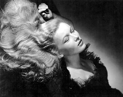
Film Noir - The gold standard of lighting
Veronica LakeThankfully the beautiful full lighting employed by film noir is being rediscovered and relished. This is not about dark light (darking) it is about playing with light and using its full expression within the range of light from the brightest light you can employ (also the best setting for the camera image) to the darkest part of the camera's range. This is light designed for cameras, cameras which needed tons of light to get any kind of exposure. So we start with those tons of light. Then we go down only to the lowest parts of what the camera can handle and no darker. And in between we have enough fill to connect the dark to the light.
Real contrast is about the middle tones just as B&W photos themselves are all about the grayscale tonal values between the paper's white and the emulsion's maximum black (dmax). The black and the white will take care of themselves as long as they are within the camera's optimum setting. The grayscale between sets the mood. By working for the camera's range we make sure we have everything pictured that we've worked so hard to put into play.
Here is a page with a set of terrific pictures. The photographer explains what he is doing and how. He is part of the "new noir" movement. Notice that he doesn't simply darken the set, he lights, illuminates the set. Indeed, without maximum light in the scene he can't have maximum blacks and shadows. He is never hiding detail. On the contrary you see detail intensely, even shadow detail. Enjoy the page. Learn by example.
http://www.prophotonut.com/2013/02/17/film-noir-a-hollywood-style-reborn/
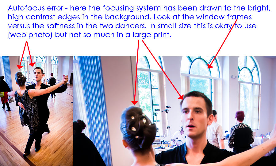
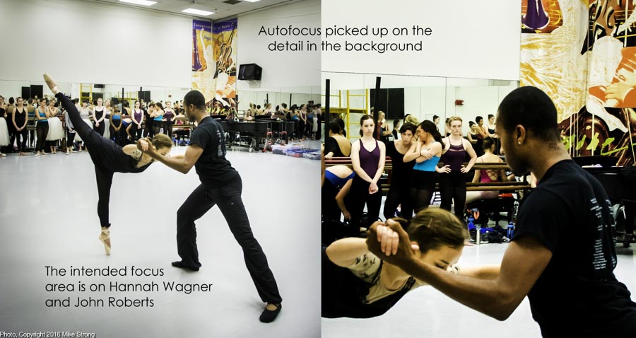
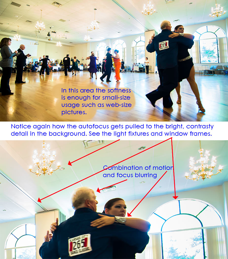
Three autofocus examples
As I explained above, autofocus is a love/hate thing with me that because of the way digital camera lenses are made is unavoidable. The few times I get back to manual focus old-school lenses I get the chance to feel how truly free and solid shooting with such lenses was and still should be.
None of these examples is egregious. They are enough for me not to pause before deciding whether to use them. If I do use them maybe only in the lower web-size resolution where the softness in the prime-interest areas is not so noticeable. But a full size print on paper may not look good.When I have a lot of light I can use a smaller aperture meaning two things: (1) more depth of field (area of sharp focus in front of the lens) and (2) possibility of using the best aperture for the lens. Usually this is 2 to 3 stops down from the widest aperture on the lens. The widest aperture is usually not the sharpest aperture for any lens which means that in low light I have to use an aperture which gives less than the best possible sharpness.
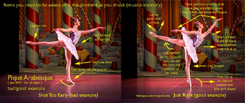
Preparation and Subject Knowledge
Here I shot too early but had enough time to realize it and take another shot immediately. (this is still not continuous drive). As such I realized the two frames together made for a good illustration. No list of items to look for will work if you don't already know what to look for. There are (1) to many items and (2) it all takes place too quickly and (3) never lets up. By the time you can consult any of the list there is no chance to even try to determine whether what is taking place matches a list.
One of the most irritating concepts to me is the blase assumption that all it takes to shoot dance photos is to show up, point a camera and click away. Most photographers think this and for many years I took this as a photographer problem. Photographers are enamored of their cameras and lenses and all the things the machines can do. But after some time I realized that dancers and choreographers also assume than merely clicking the shutter button produces desired results. In that view, it matters little or nothing whether the photographer can even recognize dance when they point and click. But it does matter.
Technique, position, story and character are what you want to see in a photograph of dance. All of those are things the photographer really needs to know about in order to shoot pictures which have multiple levels.
On the most ignorant level showing up and shooting on any motion (any), usually in motor drive (called continuous drive in digital cameras) will produce some sort of results. Most of this will not be usably good but this is what most newspaper show again and again, often to groans from the dancers and dance companies who want the publicity but also want something which represents the company and the piece. Worse, these are the pictures the newspapers seem very proud of and manage to blow up into multi-column size. This also happens with magazines and publicity departments who really need a lot of guidance and are not prone to looking for guidance.
On the most superficial level a dance-knowledgeable photographer will shoot pictures of technique. This is the dance-aware version of news photographers shooting on any motion at all. The difference is that they recognize good technique and good position.
Beyond that is a knowledge of what the piece is about. This can be a huge help in deciding what to take pictures of. This shows in sometimes small motions or formations which might not be as exciting as grande jetes but which set the tone and intent of the piece. So they become emblematic.
And a more involved level is when you've been able to spend enough time to see the characters develop in the dancers, from the point of walking through choreography until that choreography becomes embodied and natural in the dancers.
My basic two-part rule:
1 - You can only shoot what you see.
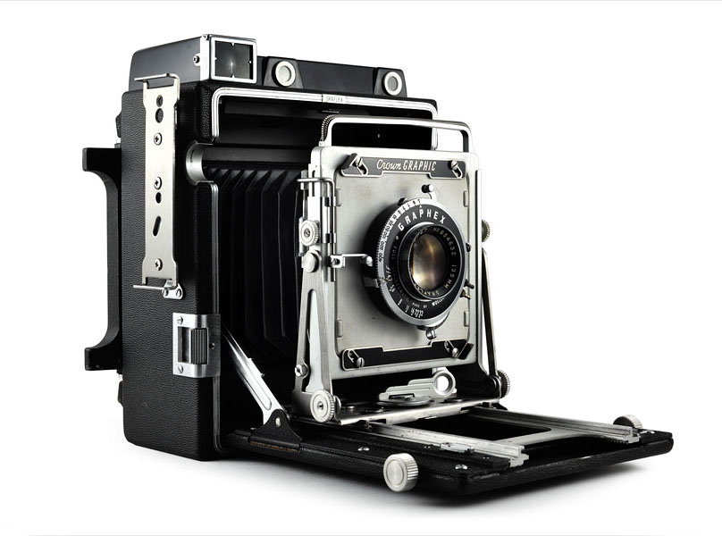
2 - You can only see what you know.My other rule is that each click represents a discrete (individual) selection. This is not new for me. In 1967 in my first and only photography class, the teacher, Frank O'Neill, told us about a time when he was a youngster, new to the Lincoln Journal Star. He and the other young photographers were using the newest, fastest equipment with 12 exposures on roll film and either 24 or 36 exposures on those few excursions into 35mm cameras - then called miniature cameras (compared to the standard of the day, 4x5 cameras - 35mm film is 1x1.5 inches per frame and 4x5s are 4x5 inches of film per frame, 13+ times the image area of a 35mm camera).
So they would should a lot of frames rapidly, change rolls and shoot again. Yet time and again the "old" guy with his 4x5 Speed Graphic and a handful of film holders (each of which held two sheets of film) would get the prime, above-the-fold shot, for the front page. Kind of like an old musket versus those new 6 shooters in the early 1800's. This is the big boxy looking camera in old movies, known as a press camera. It is what I learned on in that class and I still have a Crown Graphic (same as a Speed Graphic but without a focal plane shutter).
They were miffed at how the "old" guy could keep doing this. What they learned, said Frank O'Neill, was that the old guy knew what was coming up and where to position himself and he knew the exact best moment to shoot. He had done his preparation and homework. He only had a few shots and it could take a minute to change to another sheet of film for the next shot so he really had to select his shots. He could not waste them. The "old" guy didn't just show up and shoot away taking this chances. By the way, the "old" guy was probably younger than Frank O'Neill was at the time Frank told us his story.
The camera I first learned on, a Crown Graphic, manufactured by Graphlex. I still have a Crown Graphic and used it for many years. A Speed Graphic would show spring-loaded wind up keys on the right side for the focal plane shutter. Here we are using a leaf shutter between the lens elements in a 135mm lens (normal for a 4x5 equivalent to a 43mm lens on a full frame 35mm).
These were generically referred to as "press cameras" because they were work horses of the press. They were one of the most flexible, and I would contend, one of the best all-time camera designs ever. This could be used in a point and shoot mode (once the manual adjustments were pre-set) or with the delicacy of a view camera with rising and sliding front lens standards and drop front focusing rack (could drop below what is shown here) as well as a bellows which could extend to give a macro view of anything.
You could use a viewfinder or work directly off the ground glass focusing screen in back. It took any number of film holders and roll film backs via the patented Graphlex adapter. The rangefinder (top two round windows) could either let you move two images together or, in the dark, project two beams of light which, converging on a subject, put you in focus. The mahogony box it set it (and later a metal one) was massively sturdy and could take a lot of abuse. That bracket on the side held a large flash which could be removed to shape the lighting and to control other flash units.
Taking a picture involved loading and preparation. It was very slow compared with today but it was fast for the time. We had an acronym, FAST, to keep us working as quickly as possible with film holders in press cameras. "FAST" worked like this
- Pull a film holder (2 sheets of film) out of the bag (the one with the light side and the raised bumps or cutout notches for un-exposed film)
- Slip the film holder into the Graphlex grip on the camera back with the un-exposed film (light side/with texture)
- Pull out the dark slide on the front side of the film holder
- Now, implement the FAST acronym
- F = FOCUS - visually check the distance and set the focus
- A = APERTURE - check and set the F-stop
- S = SHUTTER - check and set the shutter speed and cock the shutter mechanism
- T = TAKE - Hold the camera viewfinder to your eye and take the picture
Today's digital cameras make multiple shots per second possible but it doesn't make the result any better. Each shot, no matter how many clicks per second or in a minute, needs to be a specific selection.
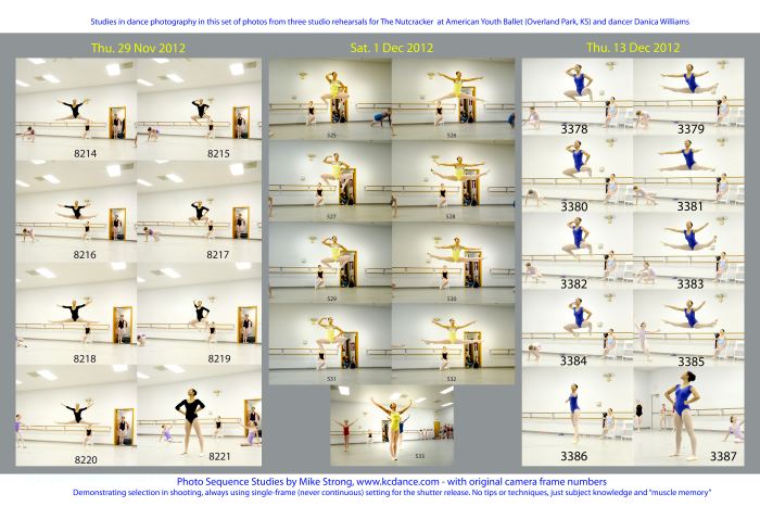
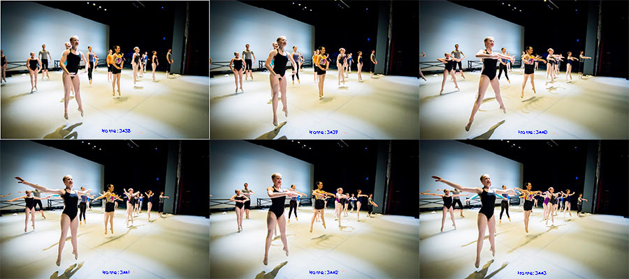
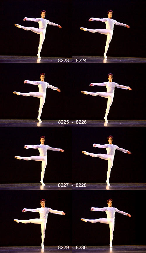
The above example is one of my studies from my sequence shooting. This is like my own warm up to get into the rhythms and the feel of the company (AYB May 2016 for "Cinderella"). Sometimes I collect a set of them, like this picture panel, as an illustration to demonstrate the need to select each shot and sometimes just for the heck of it. These are six frames in a row from 3438 through 3443 (as noted, top to bottom and left to right). Nothing is deleted. They are one after another. All shots catch the dancers in their class, at the top of their movement. This would be impossible using continuous drive (when you hear the multiple clicks from a shooter when they hit the shutter button). Continuous drive would (1) bog down as soon as the memory buffer gets full and (2) you would lose 90+% of the best shots, instead showing some in between position.
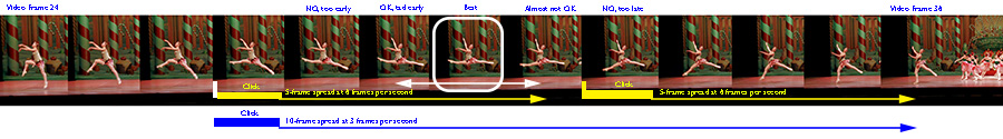
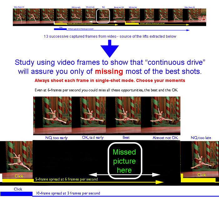
This is the starting set of video frames I am using to compare to still-camera continuous-drive frame rates. The long blue arrow on the bottom is the number of video frames at a still-camera rate of 3 frames per second in continuous drive. The thick blue line represents the still-camera shot. Likewise for the yellow arrows just above, for six frames per second in continuous drive mode with the thick portions of the line representing the still photos. The frame with the white outline represents the best frame, what you should be shooting in single-shot mode. The white double arrows represent the range of acceptable frames.The starting shutter click is slightly ahead of the best frame. I am using the too-early location as the starting point because if you are shooting in continuous-drive mode you are shooting at the first sign of movement rather than the best-selected time, hoping that the frame rate will cover you. Also, it isn't the exact start of the movement because there is a slight delay between seeing the start of something, such as a leg moving outward, and the actual shutter release. So each thick part of the line represents the first shot of any continuous-drive set of shots. In the case of a 6 fps rate we can see two still frames (two think yellow underlines) and the typical third still frame would be the last frame on the right. Notice all the opportunities missed by this method. So the next time someone tries to impress you with the number of frames a still camera can shoot in continous-drive mode, roll your eyes, even more if they are sporting hu-u-u-ugh lenses for everything.
Now we will do a break out below
To get an idea of how many opportunities are missed using continuous drive (motor drive) I decided to compare still-camera frame rates to video frames. That way I could get an idea in percentages of the success or failure of using continuous drive to shoot dance. In the illustration above you are seeing a set of frames from video shot at 30-frames-per-second (NTSC). That means that a still camera shooting as fast as 6 frames per second in continuous drive takes 1 frame for every 5 frames from the video camera (30/6=5). Or, in other words, you are missing 80% (4 frames out of 5) of the action at 6 frames per second. At the more common 3 frames per second you get 1 frame on the still camera for every 10 frames of video. That means that at 3 fps you miss 90% of the time spots in which you could make another decision to hit the shutter.Each frame, still or video, is shot according to a timer in the camera which has no relationship to any music in the room. The camera can neither listen to your music nor see the dancers.
In the illustration above, the video frames on the far left and the far right are the frames you would get in the still camera at 6 frames per second in continuous drive. The frames at the top, lifted out of the dark area, are the frames the still camera is not giving you. This is the time period containing the missed picture you should have gotten.
Note also that while I've rated the missed frames at the top into selections and non-selections it is not untypical for most newpaper editors (and a few arts magazines) to choose any of them, including the two to either side which are clearly not right. In my own experience I've learned that even when you send pictures to an arts magazine you should not trust their editors to choose the best dance pictures.
If you shoot enough frames you will be lucky enough to get some truly good frames but the reason photographers shoot with "continuous drive," at so many frames per second, is because they don't know what is good when they are shooting. They are simply trying to shoot on any movement and continuous drive is a technical device to maximize the possiblity of having good pictures. But, because they still don't know what makes a good dance shot they can (and usually will) make the wrong selections. This is really the method most guaranteed to make sure you do not get the best moments and the method guaranteed to maximize your workflow later. Having to sort through that many frames is brain numbing, just expanding the amount of work. You can only look so long before you have to take a break and then go for it again, even if you know what to look for.
Shooting this way (continuous drive, triggered by any motion) generally gets shots which are close to but never or seldom right on, usually the groaners which are so common in newspaper coverage.
It is a much easier work flow afterward if the photographer knows what to shoot in the moment in which she or he is shooting. Every shot needs to be deliberate even when shooting rapidly. That way you have less to sort through later and you already have a better idea of what to choose as well as what you shot that you think may make a good picture. Then, if you can, take it to the dancers for critique, and listen. If someone is praising you too much get another opinion.
There is always a rhythm to the actions, even when there is no music as such. If you have music you are shooting within the music and within how the dancers respond to the music, fast, early, late, etcetera. If you base your shooting on what you hear (the music) rather than looking for the start of some motion you will be shooting in the same place everyone is working to. The dancers are dancing to the music and you should be shooting in the music. There is NO TRICK. No special movement you are looking for to hit the shutter button. Yes there are moves, such as a glissard leading into a jete but all of those work to the music. That is the foundation. The rest is trimming.
Here is another such study/exercise/warm-up from some years ago at UMKC (below).
In this case we have eight frames in a row. clearly marked with the frame numbers.
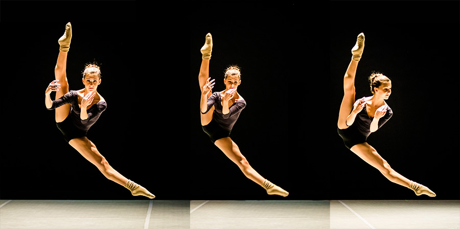
Those types of exercises allow me to casually shoot something like this, on stage after a rehearsal during Project Premiere, June 2015. Over my shoulder I noticed one of the AYB dancers practicing on stage. So turned around, pointed the camera with an 80-200mm / f-2.8 zoom and quickly shot these three frames, which was good because she finished her practice after my third frame. At least I got three frames in, her last three split leaps. I used the dividing line between the black background curtain and the light Marley to line up the frames so you can see her consistency (the dividing line really was that sharp, though I did use black clipping to make the black curtain more solid). I didn't put frame numbers on the picture because I like it as a panel but I did preserve the numbers within the filename (ProjectPremiere_2015Jun13_Etc-3382-1-0-triple900.jpg). In my nomenclature that means frames 3380, 3381 and 3382. I generally put the numbers in reverse order to make it easier to see the contributing files together on the computer in file manager followed by the composite file that you see here.I never place my camera in "C" drive (for continuous). I am always in "S" for single frame mode. Were I to have attemped the shots above in "C" drive I would never have gotten this result.
LIkewise in this example showing how being in rehearsals leads to better shots in performance:
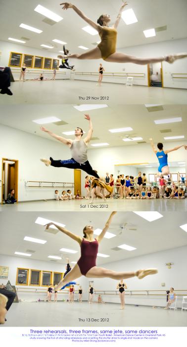
The bottom pictures show the shots in studio which led to the same shots during performance, shown across the top. In this case we have two dancers (two casts) in the same part and we have two jetes in a row. Once upstage and one downstage left. By the time I get to dress or performance I like to have the familiarity with the pieces that I can look for specific shots.
I can look at the earlier shots to check myself. Am I early? Am I late? Is the position good and is the technique right? On the row across I am a tad late on the third shot from the left but still usable (just), unlike the same shot done earlier in the studio which is very late and not usable (except as an illustration, such as here).
That is why I need rehearsal too, though not as much as the dancers. After all, you wouldn't expect dancers to show up to a performance never having rehearsed. Yet the same is expected of photographers.

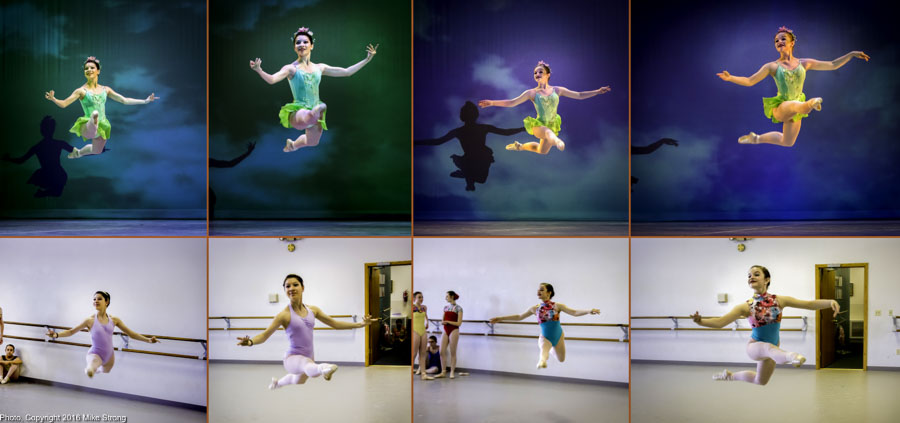
Notice that these are three dates for rehearsal and I happen to be in different locations in the studio but this is the same jete pair in each case. You can see that I am looking to get this each time and later in performance.These were taken at the same rehearsals as on the right.
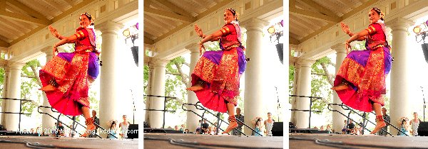
Three hops and three frames. If you don't look closely you might think this was the same shot repeated three times. Indian classical dance by Nritya at the Ethnic Enrichment Festival some years ago. Looking at the hem of her dress where it intersects the railings behind her, where it intersects the ankle bells on her right leg and the sash position shows that these are indeed separate hops.
Nutcracker rehearsal for the Russian part. I had intended to add a forth panel at performance but that one was a bit loose with uneven legs in the tucked up position. So I left this with three examples from studio rehearsal. Again, my point being that continuous drive only defeats the reason you think you are using it.